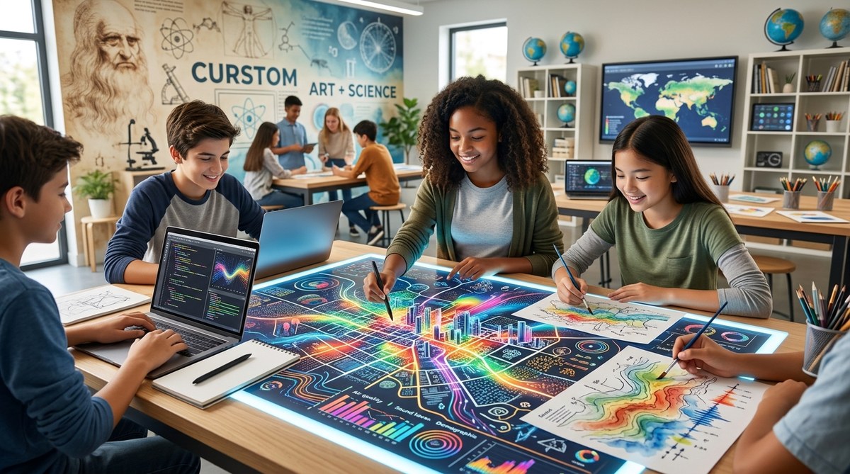
Maps are everywhere. We use them to navigate cities, track weather patterns, and visualize election results. But a map is more than a tool for getting from point A to point B. It is a story told in shapes and colors. It is a dataset made visible. And when you bring cartography into the classroom, you are doing something special. You are fusing data science with visual art. You are giving students a reason to ask questions, gather information, and then design something beautiful that communicates what they found.
Cartography is a powerful STEAM activity that naturally combines data science and visual art. By creating maps, students learn to collect and analyze data, identify patterns, and make design choices that communicate their findings. This guide gives educators practical steps to build map-based projects that spark curiosity and critical thinking.
Why Cartography Belongs in a STEAM Classroom
Subjects are often taught in isolation. Math happens in one period. Art happens in another. But the real world does not work that way. Cartography sits right at the intersection of disciplines. It requires the logic of data science and the creativity of visual art.
When students make a map, they are doing real data science. They decide what information matters. They collect and clean data. They look for patterns. They ask why certain things cluster in certain places. At the same time, they are making artistic choices. Which colors will they use? What symbols will represent different features? How will they balance visual clarity with aesthetic appeal?
This blend of skills is exactly what STEAM education advocates for. It is about teaching students to think across boundaries. It is about showing them that a scientist needs creativity and an artist needs structure.
The Core Ingredients of a Map Project
Before you start, it helps to understand the three main components of any cartography project. These elements will guide your lesson planning.
- Data collection and cleaning: Students gather information. This could be survey responses, census data, or observations from a schoolyard. They then clean the data, removing errors and deciding what to include.
- Spatial reasoning and analysis: Students plot the data on a geographic framework. They look for clusters, outliers, and relationships. They ask questions like “Why is this happening here and not there?”
- Visual design and storytelling: Students choose colors, symbols, and layouts. They create a legend. They decide how to guide the viewer’s eye. They turn raw numbers into a narrative.
Each of these steps can stand alone as a lesson. Together, they form a complete project that can last a week or a whole semester.
A Step-by-Step Process for Your Classroom
Here is a practical sequence you can adapt for any grade level. It assumes you have access to basic mapping tools, but you can scale it up or down.
-
Choose a topic that matters to your students. Start with something local. Maybe it is the locations of favorite lunch spots in the cafeteria. Maybe it is the age of trees on the school campus. Let students suggest ideas. When they care about the subject, they invest more in the process.
-
Collect the data as a class. Use a simple survey tool or a paper checklist. For a middle school project on noise levels, students could measure decibels in different parts of the school using a free phone app. Record the data in a shared spreadsheet.
-
Clean and organize the data together. This is a critical step that is often skipped. Talk about outliers. What do you do with a measurement that seems wrong? This is a perfect moment to discuss data integrity in a concrete way.
-
Introduce the mapping tool. You can use paper and colored pencils for a low-tech version. For a digital option, try free tools like Google My Maps or even a simple grid on a whiteboard. The goal is to place the data points in space.
-
Analyze the patterns. Ask open-ended questions. What do you notice? What surprises you? What questions does this map raise? Let students talk in pairs before sharing with the whole class.
-
Design the final visual. This is where art takes center stage. Students choose a color palette. They decide on symbol sizes. They create a legend and a title. Encourage them to think about their audience. What do they want someone to feel or understand when they look at this map?
-
Present and reflect. Have students share their maps with the class. Ask them to explain one design choice and one data insight. This reflection solidifies the learning.
Common Pitfalls and How to Avoid Them
Even the best lesson plans can run into trouble. Here is a table of common mistakes in map-based projects and how to steer clear of them.
| Mistake | Why It Happens | How to Fix It |
|---|---|---|
| Data overload | Students try to map too many variables at once. | Limit the project to one or two variables. Simplicity leads to clarity. |
| Unreadable legend | Symbols are too similar or colors are confusing. | Have students test their legend on a classmate before finalizing. |
| Ignoring the audience | Students design for themselves, not for a viewer. | Give them a specific audience to design for, like younger students or parents. |
| Forgetting the question | The map shows data but tells no story. | Start with a guiding question. Every map should attempt to answer it. |
| Tool frustration | Students spend more time learning software than thinking. | Pre-teach the tool in a low-stakes warm-up activity. |
What Experts Say About Mapping and Learning
Educators who use cartography in their classrooms often see surprising results. Students who struggle with traditional math suddenly excel when numbers become points on a map. Students who think of themselves as “not artistic” find confidence in designing a clear legend.
“When students make a map, they are not just learning geography. They are learning how to think. They learn to ask better questions and to communicate their answers with clarity and purpose.” – Dr. Liana Webb, curriculum specialist and author of Mapping Minds
This kind of interdisciplinary work builds skills that last. It teaches students to be flexible thinkers. It shows them that learning is not about memorizing facts. It is about making sense of the world.
Bringing Data Science and Art Together in Practice
Let us look at a concrete example from a real classroom. A fifth-grade teacher in Portland, Oregon, wanted to teach her students about local food systems. She asked each student to interview one neighbor about where they buy their groceries. The students recorded the responses on a class chart.
Next, they plotted the locations of the grocery stores on a map of their neighborhood. They used different colored pins for chain stores and farmers’ markets. Then they added a layer showing which families lived within walking distance of each store.
The result was a map that told a clear story about food access. The students saw that many of their neighbors had to travel far to get fresh produce. This led to a class discussion about urban planning and equity. The map was not just a project. It was a catalyst for civic awareness.
This is the power of cartography in education. It makes abstract concepts tangible. It gives students a voice in their own learning.
Tools and Resources to Get Started
You do not need expensive software to bring cartography into your classroom. Here are some accessible options.
- Paper and colored pencils: The simplest and most flexible approach. Great for younger students or for brainstorming.
- Google My Maps: Free and easy to use. Students can add points, lines, and shapes. They can also embed photos and notes.
- StoryMaps by Esri: A free platform that combines maps with narrative text and multimedia. Ideal for older students who want to tell a deeper story.
- Datawrapper: A free tool for creating charts and maps from data. Useful for students who want to explore data visualization.
For more ideas on blending disciplines, check out our guide on unlock creativity by merging art and science in your classroom. It offers additional strategies for building interdisciplinary projects.
Making the Invisible Visible
Cartography teaches students a fundamental truth. Data is not just numbers on a page. It is a record of human experience. It is the path of a migrating bird. It is the concentration of air pollution in a neighborhood. It is the favorite reading spots in a library.
When students learn to map that data, they learn to see the invisible. They learn to find patterns in chaos. They learn to tell stories with precision and beauty.
This is the heart of what we do as educators. We help students make sense of their world. We give them the tools to ask questions and the confidence to share what they find. Cartography is one of those tools. It is a tool that blends logic and creativity. It is a tool that belongs in every classroom.
So start small. Pick a topic. Gather some data. Let your students create a map. Watch what happens when they realize that they are both scientists and artists. That is the moment when learning becomes unforgettable.
If you are ready to build more projects like this, our guide on how to design interdisciplinary projects that ignite student curiosity in 2026 can help you plan your next unit. And for a deeper look at the philosophy behind this approach, read about the surprising connection between artistic observation and scientific inquiry. The best learning happens when we stop separating subjects and start connecting them.